


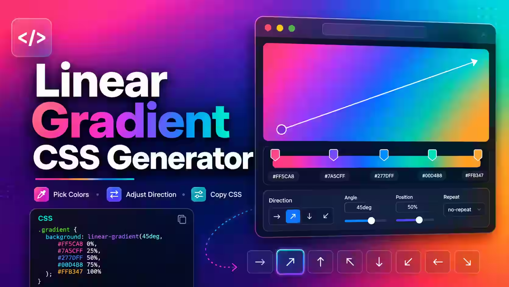
A basic CSS linear gradient needs two colors:
background: linear-gradient(#0f766e, #082f49);
Without a direction, the browser draws the first color at the top and the second at the bottom. Add a direction, angle or extra color stops only when the design needs them.
Use the gradient as an image
linear-gradient() creates a CSS image, not a single color. Put it in background or background-image. It will not work as the value of background-color.
The MDN linear-gradient reference explains the syntax and color-stop rules. MDN also notes that a gradient has no natural width, height or aspect ratio. It fills the box where you use it.
Direction and angle examples
Use a readable direction when it matches the design:
linear-gradient(to right, #2563eb, #06b6d4)linear-gradient(to bottom right, #f97316, #be123c)linear-gradient(135deg, #111827, #334155)
to right starts on the left and ends on the right. Angle values move clockwise. In CSS gradients, 0deg points upward and 90deg points right. If a copied angle looks reversed, check the actual preview instead of guessing.
Place color stops on purpose
Two colors create a smooth transition. Percentages let you control where each color appears:
background: linear-gradient(90deg, #0f172a 0%, #1d4ed8 55%, #38bdf8 100%);
The first color begins at 0 percent. Blue reaches its stated color at 55 percent, and the lighter cyan reaches full strength at the end. You can move the middle stop to change where most of the transition happens.
Stops do not have to be evenly spaced. They can also create hard lines. Two adjacent colors at the same position produce a sharp boundary:
background: linear-gradient(90deg, #f8fafc 0 50%, #e2e8f0 50% 100%);
Use repeating-linear-gradient() when a stripe pattern should repeat. A normal linear gradient does not repeat by itself.
Transparency needs a real underlying color
A transparent stop blends with whatever sits behind the element. That may be the page background, another image or another gradient layer. The same code can therefore look different in two places.
Set a fallback background color before the gradient:
background-color: #0f172a;background-image: linear-gradient(120deg, rgba(37, 99, 235, .88), rgba(15, 23, 42, .96));
The solid color gives the element a predictable base if the gradient fails or loads in an environment that strips the image value.
Check text contrast across the whole box
A heading may be readable on the dark end and disappear on the light end. Check the text where it can actually sit at mobile, tablet and desktop widths. A responsive layout can move the same words onto a different part of the gradient.
Do not judge contrast from the color codes alone. The final result depends on stop positions, transparency, background layers and text placement. Add a darker overlay, move the stops or place text inside a solid panel when readability changes too much.
Keep generated CSS small enough to maintain
A visual generator can help choose colors and stops, but the copied output should still make sense when someone opens the stylesheet later. Remove duplicate stops and vendor prefixes that your browser-support policy does not need. Give important colors custom property names when they are reused.
For example:
:root { --hero-start: #0f766e; --hero-end: #082f49; }
.hero { background: linear-gradient(135deg, var(--hero-start), var(--hero-end)); }
That is easier to update than repeating the same hex values across several components.
Layer gradients carefully
CSS allows more than one background image. The first one is drawn on top:
background-image: linear-gradient(rgba(15, 23, 42, .65), rgba(15, 23, 42, .65)), url("hero.jpg");
This pattern can darken a photo behind text. It does not edit the source photo. It changes how the browser renders that element.
The MDN guide to CSS gradients includes linear, radial, conic and repeating examples. Use the simplest gradient type that matches the design.
Check how the element size changes the gradient
The same rule can look different on a wide desktop card and a tall phone card. The browser draws the gradient inside the current box, so the distance between its corners and stops changes with the box.
Test the component at its real minimum and maximum sizes. If a narrow screen puts the bright stop behind a white heading, use a breakpoint, move the stop or place the text on a steady color layer. Do not export the gradient as a screenshot just to freeze it. That adds an image request, loses clean scaling and still may not fit every layout.
A CSS gradient normally costs less maintenance than separate background images for every size. Complex layered gradients can still take rendering work, especially when they animate over a large area. Keep motion limited, test scrolling on a normal phone and remove effects that do not help the design.
Test before shipping
- Paste the rule into the real component, not an empty demo box.
- Resize the page and watch where text lands.
- Check focus indicators, links and buttons over the background.
- Test light and dark text if the component changes theme.
- Confirm the fallback color does not hide content.
- Open the page in the browsers your project supports.
- Run your normal accessibility and visual regression checks.
Common mistakes
| Symptom | Fix |
| No gradient appears | Use the value with background or background-image, and check commas and parentheses. |
| The angle feels backward | Remember that 0 degrees points upward and 90 degrees points right. |
| A sharp band appears | Check for two stops at the same or reversed positions. |
| Text loses contrast | Adjust the stops, add an overlay or use a solid text panel. |
| The gradient changed after moving it | Check the new element size and the color underneath transparent stops. |
Questions about linear gradients
How many colors can a linear gradient contain?
It needs at least two color stops and can contain more. Use only the stops the design needs.
Can I animate a gradient?
Some gradient-related values can be animated, but support and interpolation can vary. Test the exact effect and respect reduced-motion preferences.
Is a CSS gradient an image file?
No separate file is downloaded. The browser generates an image from the CSS value.
Why does transparent look gray?
It is blending with the color or image behind it. Set a known base color and inspect all background layers.
Should every button use a gradient?
No. Use one when it supports the visual system and keeps text, focus and states easy to read.



 MagicalToolz AI Support
Comments (0)
Use comments for article-specific feedback. Use the contact page for bugs and support requests.
Leave a Comment
No comments yet. Be the first to share something useful.