


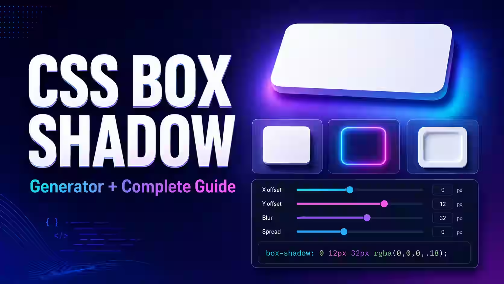
Current status: The dedicated Magical Toolz CSS shadow generator is not active. This page is a standalone CSS reference with declarations you can copy and adjust manually.
Have you ever spent several minutes changing a box-shadow declaration in browser developer tools, only to end up with a shadow that still looks too dark, too wide, or strangely disconnected from the element? A good shadow depends on several values working together, and guessing all of them manually can slow down even a simple design task.
This guide explains the complete box-shadow syntax, what each generator control does, how box shadows differ from text and drop shadows, and how to create practical shadow effects for cards, buttons, inputs, headings, modals, and modern interfaces.
What Is the CSS Box-Shadow Property?
The CSS box-shadow property adds one or more shadow effects around an element’s frame. A shadow is normally described by its horizontal and vertical offsets, blur radius, spread radius, and color. The optional inset keyword moves the effect inside the element.
Here is a common example:
.card {
 box-shadow: 0 8px 24px rgba(15, 23, 42, 0.16);
}
This declaration creates an outer shadow with:
0: horizontal offset8px: vertical offset24px: blur radiusrgba(15, 23, 42, 0.16): shadow color and opacity
Because no spread value is provided, its default value is zero. Because inset is absent, the shadow appears outside the element.
The tool supports:
- Horizontal and vertical shadow positioning
- Blur and spread adjustments
- Custom shadow colors and opacity
- Outer and inset box shadows
- Text-shadow generation
- Multiple layered shadows
- Live visual preview
- Ready-to-copy CSS output
- Open the CSS Shadow Generator in a modern browser.
- Choose whether you want to create a box shadow or text shadow.
- Adjust the horizontal and vertical offsets.
- Change the blur radius to make the edge harder or softer.
- For a box shadow, adjust the spread radius when required.
- Select a shadow color and set its opacity.
- Enable inset mode if the shadow should appear inside the element.
- Add more shadow layers if you need a deeper or more realistic effect.
- Check the result in the live preview.
- Copy the generated CSS and paste it into your stylesheet.
After copying the code, test it against the actual background, border radius, colors, and component size used in your project. A shadow that looks balanced in an isolated preview may need a small adjustment inside the finished interface.
Understanding CSS Box-Shadow Syntax
A complete single-layer declaration commonly follows this pattern:
box-shadow:
 offset-x
 offset-y
 blur-radius
 spread-radius
 color;
The optional inset keyword may appear before or after the other values:
box-shadow:
 inset 0 2px 8px 0 rgba(15, 23, 42, 0.25);
The first two length values—horizontal and vertical offset—are required. Blur and spread are optional. However, when both are present, blur must come before spread.
What Each Shadow Control Does
Horizontal Offset
The horizontal or X offset moves the shadow left or right:
- A positive value moves it to the right.
- A negative value moves it to the left.
- Zero keeps it centred horizontally.
.right-shadow {
 box-shadow: 12px 0 18px rgba(15, 23, 42, 0.2);
}
.left-shadow {
 box-shadow: -12px 0 18px rgba(15, 23, 42, 0.2);
}
Vertical Offset
The vertical or Y offset moves the shadow up or down:
- A positive value moves it downward.
- A negative value moves it upward.
- Zero places it evenly around the vertical position.
A downward shadow can suggest that the light source is above the component. Keeping a consistent implied light direction across the page helps different elements feel as if they belong to the same interface.
Blur Radius
The blur radius controls how gradually the shadow fades:
.hard-shadow {
 box-shadow: 6px 6px 0 #0f172a;
}
.soft-shadow {
 box-shadow: 0 12px 32px rgba(15, 23, 42, 0.18);
}
A blur value of zero produces a hard edge. Increasing the value makes the shadow wider, softer, and generally lighter toward its outer edge. Negative blur values are invalid.
There is no universal blur value for every card or button. Component size, background color, contrast, and intended elevation all affect what looks appropriate.
Spread Radius
Spread changes the shadow’s size before the blur is applied:
- A positive spread expands the shadow.
- A negative spread contracts it.
- Zero keeps the shadow close to the element’s original size.
.expanded-shadow {
 box-shadow: 0 8px 20px 4px rgba(15, 23, 42, 0.18);
}
.compact-shadow {
 box-shadow: 0 12px 24px -8px rgba(15, 23, 42, 0.35);
}
Negative spread is useful for keeping a shadow concentrated below a card instead of allowing it to appear equally around every side.
Shadow Color and Opacity
Pure black shadows can look heavy, especially on light interfaces. Semi-transparent shadows usually blend more naturally:
box-shadow: 0 10px 30px rgba(15, 23, 42, 0.14);A shadow does not have to be neutral black. A subtle tinted shadow based on the surrounding background or brand palette can feel more integrated:
box-shadow: 0 14px 36px rgba(79, 70, 229, 0.22);You can use the Online Color Picker to create a suitable color value for your design.
Inset Shadow
The inset keyword changes an outer shadow into an inner shadow:
.recessed-panel {
 box-shadow:
 inset 0 2px 8px rgba(15, 23, 42, 0.22);
}
Inset shadows can make a control look pressed, recessed, or carved into its background. They work well for selected buttons, progress tracks, input fields, and soft UI effects. They should not be the only indication that a control is active or disabled.
Practical Example 1: Subtle Card Shadow
A card shadow should separate content from its background without making the card look as if it is floating far above the page.
.content-card {
 padding: 24px;
 background: #ffffff;
 border: 1px solid #e2e8f0;
 border-radius: 18px;
 box-shadow:
 0 8px 24px rgba(15, 23, 42, 0.1);
}
The zero horizontal offset keeps the shadow centred. The downward offset suggests a light source above the card, while the low-opacity color keeps the effect restrained.
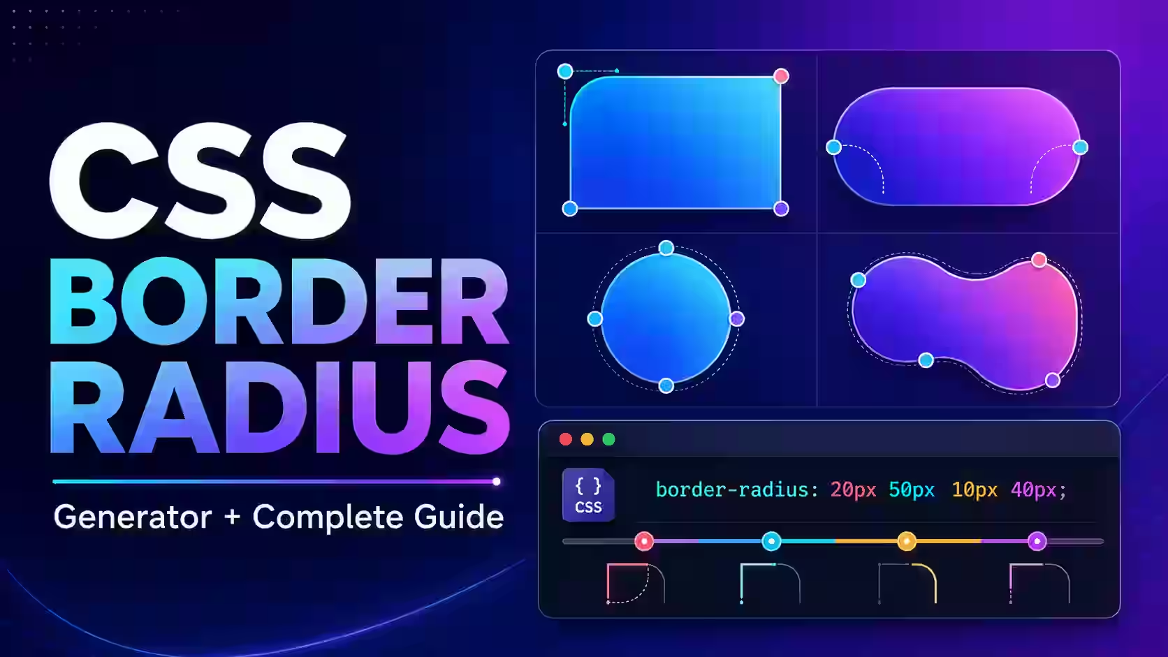
You can create the rounded corners with the CSS Border Radius Generator.
Practical Example 2: Floating Button Shadow
.primary-button {
 display: inline-flex;
 align-items: center;
 justify-content: center;
 min-height: 44px;
 padding: 12px 22px;
 color: #ffffff;
 font-weight: 700;
 background: #2563eb;
 border: 0;
 border-radius: 12px;
 box-shadow:
 0 8px 18px rgba(37, 99, 235, 0.28);
 cursor: pointer;
 transition:
 transform 180ms ease,
 box-shadow 180ms ease;
}
.primary-button:hover {
 transform: translateY(-2px);
 box-shadow:
 0 12px 24px rgba(37, 99, 235, 0.34);
}
.primary-button:active {
 transform: translateY(0);
 box-shadow:
 0 4px 10px rgba(37, 99, 235, 0.24);
}
.primary-button:focus-visible {
 outline: 3px solid #facc15;
 outline-offset: 3px;
}
The hover effect combines a small upward movement with a deeper shadow. The active state reduces the elevation, making the button feel pressed. A visible focus outline remains necessary for keyboard users.
You can build the rest of the component using the CSS Button Generator.
Practical Example 3: Inset Input Field
.search-input {
 width: 100%;
 min-height: 46px;
 padding: 10px 14px;
 color: #0f172a;
 background: #f8fafc;
 border: 1px solid #cbd5e1;
 border-radius: 12px;
 box-shadow:
 inset 0 2px 4px rgba(15, 23, 42, 0.08);
}
.search-input:focus {
 border-color: #2563eb;
 outline: 0;
 box-shadow:
 inset 0 2px 4px rgba(15, 23, 42, 0.06),
 0 0 0 3px rgba(37, 99, 235, 0.2);
}
The inset shadow adds subtle depth. The second shadow on focus creates a visible ring outside the input. Do not rely only on color or shadow to communicate an error; include an explanatory message as well.
Practical Example 4: CSS Glow Effect
A centered shadow with no offset can create a glow:
.glow-card {
 background: #111827;
 border: 1px solid rgba(34, 211, 238, 0.45);
 border-radius: 20px;
 box-shadow:
 0 0 28px rgba(34, 211, 238, 0.35);
}
Colored glows work particularly well on dark interfaces, gaming pages, promotional banners, and selected states. Keep enough contrast between text and background, and avoid using a bright glow behind long passages of text.
How to Create Multiple Box Shadows
CSS supports multiple shadow layers separated by commas:
.layered-card {
 box-shadow:
 0 2px 4px rgba(15, 23, 42, 0.08),
 0 10px 24px rgba(15, 23, 42, 0.1),
 0 24px 48px rgba(15, 23, 42, 0.08);
}
Each layer has a different offset, blur, and opacity. The smaller shadow provides contact near the element, while the larger layers create a gradual sense of elevation.
Create a Neumorphism Shadow
Neumorphism commonly pairs a darker shadow with a lighter shadow in the opposite direction:
.soft-ui-button {
 color: #334155;
 background: #e2e8f0;
 border: 0;
 border-radius: 18px;
 box-shadow:
 10px 10px 24px rgba(148, 163, 184, 0.65),
 -10px -10px 24px rgba(255, 255, 255, 0.9);
}
This creates a soft raised surface. Neumorphic controls can have weak boundaries, so preserve clear labels, focus states, and sufficient contrast. For a combined visual workflow, use the Glassmorphism and Neumorphism CSS Generator.
How to Generate a CSS Text Shadow
.hero-heading {
 color: #ffffff;
 text-shadow:
 0 3px 12px rgba(15, 23, 42, 0.45);
}
You can also layer text shadows:
.neon-heading {
 color: #ffffff;
 text-shadow:
 0 0 6px #22d3ee,
 0 0 16px rgba(34, 211, 238, 0.8),
 0 0 32px rgba(37, 99, 235, 0.65);
}
Text shadows should support readability rather than replace it. A large blur behind small body text often makes the characters harder to read.
Box-Shadow vs Filter Drop-Shadow
Although their names sound similar, box-shadow and filter: drop-shadow() can produce different results.
| Feature | box-shadow | drop-shadow() |
|---|---|---|
| Shadow basis | Element’s rectangular box | Visible alpha shape of the rendered image |
| Spread radius | Supported | Not supported |
| Inset shadow | Supported | Not supported |
| Best for | Cards, buttons, panels and inputs | Transparent PNGs, SVGs and irregular shapes |
For example, box-shadow around a transparent PNG follows its rectangular image box. A filter drop shadow follows the visible opaque or semi-transparent pixels more closely:
.transparent-logo {
 filter:
 drop-shadow(0 8px 12px rgba(15, 23, 42, 0.3));
}
Common Box-Shadow Problems
The shadow is not visible
Check whether an ancestor has overflow: hidden;, which may clip the shadow. Also confirm that the shadow color contrasts with the page background and is not fully transparent.
The shadow looks like a dark border
Reduce the opacity or spread and increase the blur. A shadow with zero blur creates a hard edge.
The shadow appears on every side
Increase the vertical offset or use a negative spread value to concentrate it beneath the element.
The shadow does not follow rounded corners
Apply border-radius to the same element. A normal box shadow follows the element’s rounded outer shape.
The shadow changes the layout
A box shadow does not add to the CSS box model dimensions. However, it can visually overlap nearby content or be clipped by a container, so you may still need suitable spacing.
The inset shadow covers content
An inset shadow is painted above the background but below the element’s content. Reduce its spread, blur, or opacity if it makes the inner area appear too dark.
Performance Tips for CSS Shadows
Static shadows are normally straightforward for modern browsers, but very large blurred areas, numerous layers, and continuously animated shadows can require additional rendering work.
- Use only the shadow layers that materially improve the design.
- Avoid animating large blur and spread values continuously.
- Test scrolling and hover effects on a mid-range mobile device.
- Keep shadows subtle on repeated components such as long card grids.
- Animate transform and opacity where they can create the same visual result.
- Use consistent shadow tokens instead of generating unrelated values for every component.
Build a Consistent Shadow Scale
A small design system can define reusable shadow levels:
:root {
 --shadow-sm:
 0 2px 6px rgba(15, 23, 42, 0.08);
 --shadow-md:
 0 8px 24px rgba(15, 23, 42, 0.12);
 --shadow-lg:
 0 18px 45px rgba(15, 23, 42, 0.16);
}
.dropdown {
 box-shadow: var(--shadow-sm);
}
.card {
 box-shadow: var(--shadow-md);
}
.modal {
 box-shadow: var(--shadow-lg);
}
This approach keeps the visual hierarchy predictable. It also makes future design changes easier because the shared values can be updated in one place.
CSS Shadow Checklist
- The implied light direction is consistent with nearby components.
- The shadow is visible without becoming the main visual focus.
- Text and controls remain readable.
- Keyboard focus is not communicated only through a faint shadow.
- The effect is not clipped by an ancestor container.
- Repeated cards use consistent elevation values.
- Multiple layers are used intentionally.
- The design has been tested on both light and dark backgrounds.
- The effect remains smooth on mobile devices.
A polished CSS shadow depends on more than adding a large blur behind an element. Offset suggests the direction of light, blur controls softness, spread changes the shadow’s footprint, and opacity determines how naturally it blends with the background. Multiple layers can create more realistic depth, while inset shadows can make a surface appear pressed or recessed.



 MagicalToolz AI Support
Comments (0)
Use comments for article-specific feedback. Use the contact page for bugs and support requests.
Leave a Comment
No comments yet. Be the first to share something useful.