


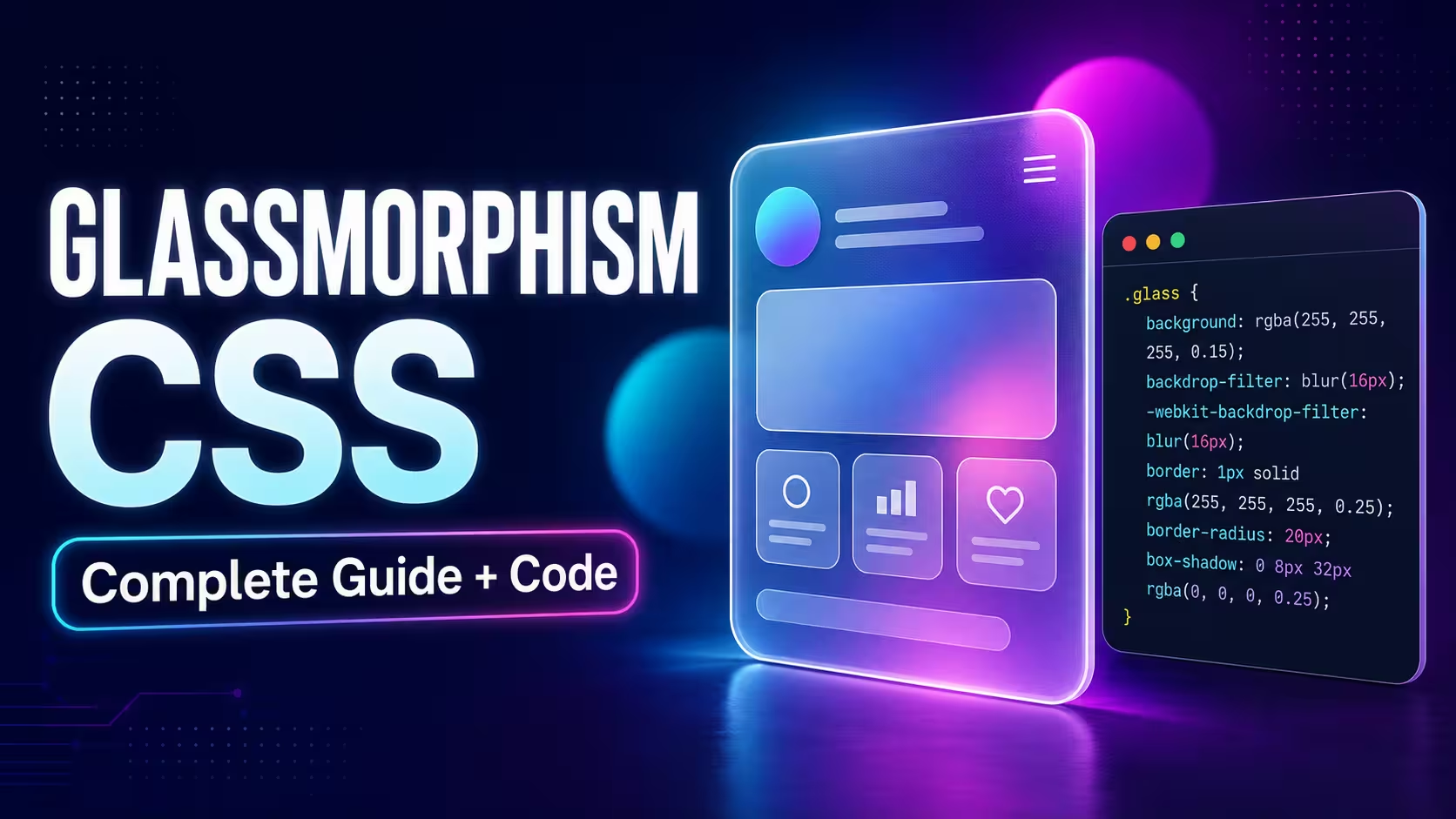
Glassmorphism is a modern UI design style that makes cards, navigation bars, forms, and other interface elements look like translucent frosted glass. You can create the effect with regular CSS by combining a semi-transparent background, backdrop-filter, a light border, rounded corners, and a carefully balanced shadow.
If you are learning how to make glassmorphism in CSS, the most important point is that blur alone is not enough. The background behind the element, its transparency, text contrast, border, and shadow all work together to create a convincing glass effect.
In this guide, you will build a complete glassmorphism card using HTML and CSS, understand every property involved, add a fallback for unsupported situations, and learn how to keep the design readable and responsive. If you prefer designing visually, you can also use the free Glassmorphism and Neumorphism CSS Generator to adjust the effect and copy the generated CSS.
What Is Glassmorphism in CSS?
Glassmorphism is a visual style that imitates a sheet of frosted or translucent glass. Content behind the glass panel remains partly visible, but it appears blurred. This separation gives the interface a sense of depth without completely hiding its background.
A typical glassmorphism effect uses the following CSS properties:
- Semi-transparent background: Allows the background behind the element to remain partially visible.
- Backdrop blur: Blurs the content located behind the glass element.
- Light border: Defines the edge of the glass panel.
- Border radius: Gives the panel smooth, rounded corners.
- Box shadow: Separates the panel from the page and adds depth.
The main property is backdrop-filter. Unlike the regular filter property, which affects an element and its contents, backdrop-filter applies graphical effects to the area behind an element. The element must therefore be transparent or partially transparent for the blur to be visible.
Basic Glassmorphism CSS Code
Here is a simple reusable CSS glass effect:
.glass-card {
 background: rgba(255, 255, 255, 0.18);
 border: 1px solid rgba(255, 255, 255, 0.35);
 border-radius: 20px;
 box-shadow: 0 8px 32px rgba(15, 23, 42, 0.25);
 backdrop-filter: blur(14px);
 -webkit-backdrop-filter: blur(14px);
}
This snippet creates the visual surface, but it must be placed over a background containing colors, shapes, an image, or a gradient. If the area behind the card is a flat solid color, the blur may be technically active but almost impossible to see.
Complete Glassmorphism Card Using HTML and CSS
The following example creates a responsive profile-style card. It uses only HTML and CSS, so no JavaScript or external UI framework is required.
HTML
<main class="glass-page">
 <div class="shape shape-one" aria-hidden="true"></div>
 <div class="shape shape-two" aria-hidden="true"></div>
 <article class="glass-card">
 <span class="card-label">CSS Tutorial</span>
 <h1>Frosted Glass Card</h1>
 <p>
 A responsive glassmorphism card created with a transparent
 background, backdrop blur, border, and box shadow.
 </p>
 <a class="glass-button" href="#">Explore Design</a>
 </article>
</main>
CSS
* {
 box-sizing: border-box;
}
body {
 margin: 0;
 font-family: Arial, Helvetica, sans-serif;
}
.glass-page {
 position: relative;
 isolation: isolate;
 display: grid;
 min-height: 100vh;
 place-items: center;
 overflow: hidden;
 padding: 24px;
 color: #ffffff;
 background:
 linear-gradient(135deg, #172554 0%, #581c87 50%, #0f766e 100%);
}
.shape {
 position: absolute;
 z-index: -1;
 border-radius: 50%;
 filter: blur(2px);
}
.shape-one {
 top: 8%;
 left: 10%;
 width: 220px;
 height: 220px;
 background: #38bdf8;
}
.shape-two {
 right: 8%;
 bottom: 8%;
 width: 280px;
 height: 280px;
 background: #f472b6;
}
.glass-card {
 width: min(100%, 520px);
 padding: clamp(24px, 5vw, 48px);
 background: rgba(255, 255, 255, 0.16);
 border: 1px solid rgba(255, 255, 255, 0.35);
 border-radius: 24px;
 box-shadow: 0 24px 60px rgba(15, 23, 42, 0.35);
 backdrop-filter: blur(16px) saturate(140%);
 -webkit-backdrop-filter: blur(16px) saturate(140%);
}
.card-label {
 display: inline-block;
 margin-bottom: 12px;
 color: #e0f2fe;
 font-size: 0.8rem;
 font-weight: 700;
 letter-spacing: 0.08em;
 text-transform: uppercase;
}
.glass-card h1 {
 margin: 0 0 16px;
 font-size: clamp(2rem, 6vw, 3.5rem);
 line-height: 1.1;
}
.glass-card p {
 margin: 0 0 28px;
 color: rgba(255, 255, 255, 0.9);
 font-size: 1rem;
 line-height: 1.7;
}
.glass-button {
 display: inline-flex;
 align-items: center;
 justify-content: center;
 min-height: 44px;
 padding: 12px 20px;
 color: #172554;
 font-weight: 700;
 text-decoration: none;
 background: #ffffff;
 border: 2px solid transparent;
 border-radius: 12px;
 transition: transform 180ms ease, box-shadow 180ms ease;
}
.glass-button:hover {
 transform: translateY(-2px);
 box-shadow: 0 10px 24px rgba(15, 23, 42, 0.25);
}
.glass-button:focus-visible {
 outline: 3px solid #fef08a;
 outline-offset: 4px;
}
You can paste this code into a blank HTML project and replace the heading, paragraph, colors, and link with your own content.
How the Glassmorphism Effect Works
1. Add a visible background
Glassmorphism needs something behind the transparent panel. A gradient, background image, or a few colored shapes makes the blur visible. In the example above, the page uses a gradient and two decorative circles.
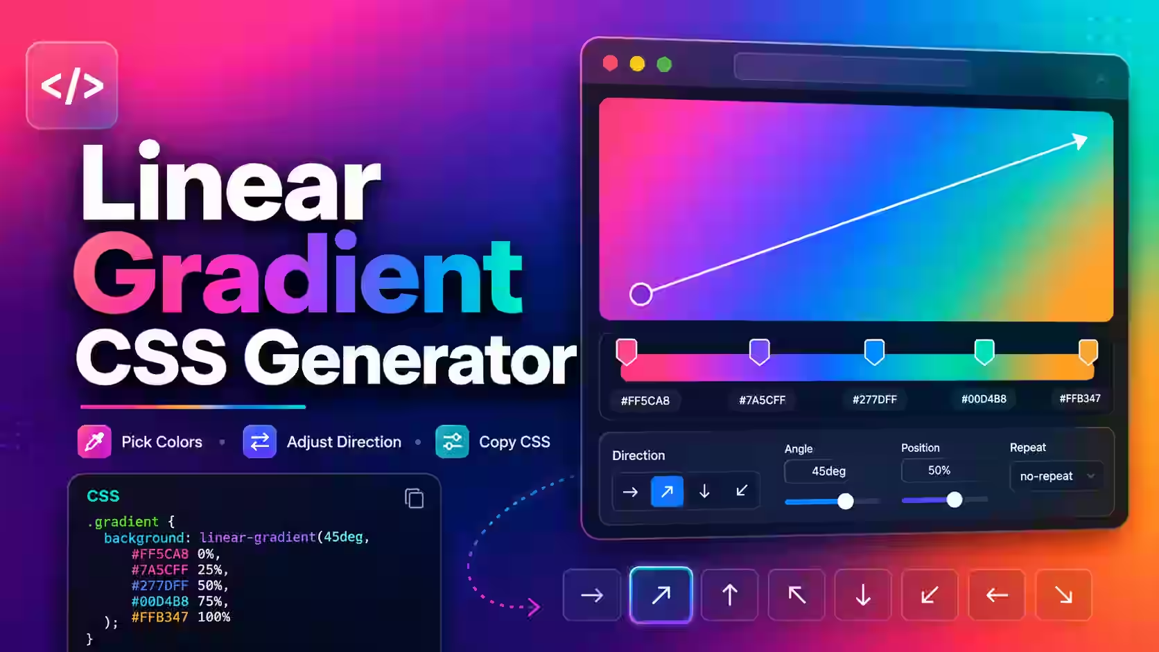
You can create a suitable background with the Gradient CSS Generator if you do not want to write gradient values manually.
2. Use a semi-transparent background
background: rgba(255, 255, 255, 0.16);The alpha value in rgba() controls transparency. In this example, 0.16 means the white background is highly transparent. Increasing the value makes the card more opaque; decreasing it reveals more of the background.
Do not apply opacity to the entire card unless you want its text and buttons to become transparent as well. A semi-transparent background color normally provides better control.
3. Blur the area behind the card
backdrop-filter: blur(16px);
-webkit-backdrop-filter: blur(16px);
The first declaration is the standard CSS property. The prefixed declaration improves compatibility with browsers and browser versions that expect the WebKit form.
A value between approximately 8px and 20px is a practical starting range for many cards, but there is no universal perfect value. The correct amount depends on the size of the panel and the amount of detail in its background.
4. Add a subtle glass border
border: 1px solid rgba(255, 255, 255, 0.35);A thin translucent border makes the edge look as if it is catching light. If the border is too bright or thick, the card may look like a regular outlined box instead of glass.
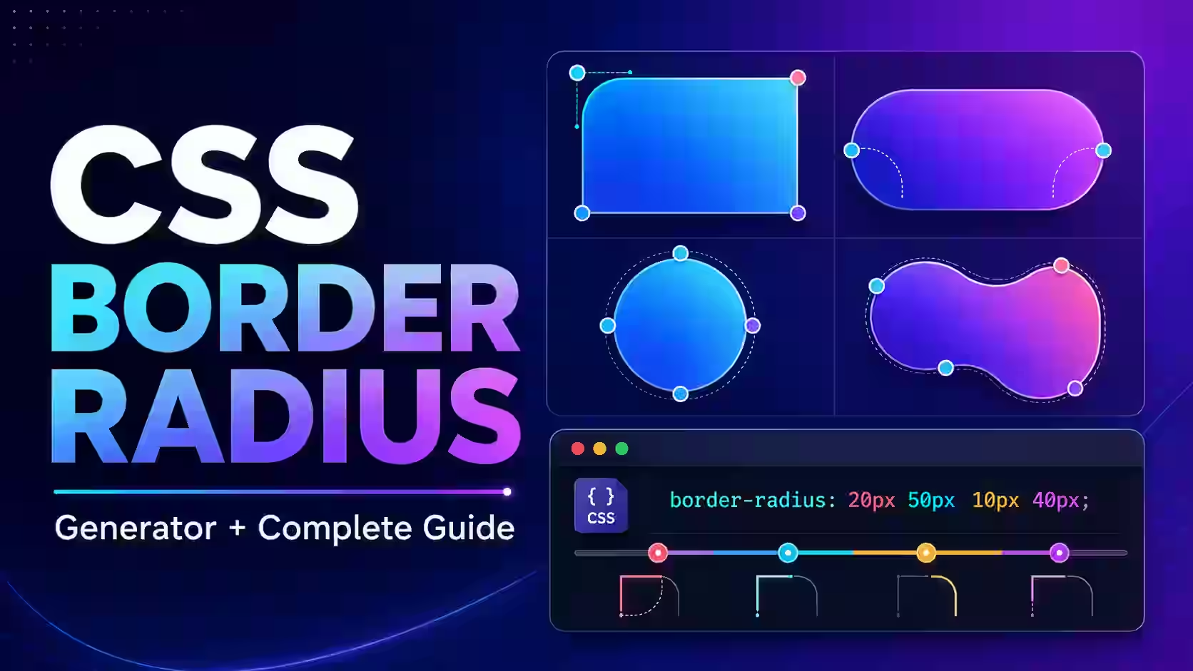
You can experiment with rounded shapes using the Online Border Radius Generator.
5. Create depth with a soft shadow
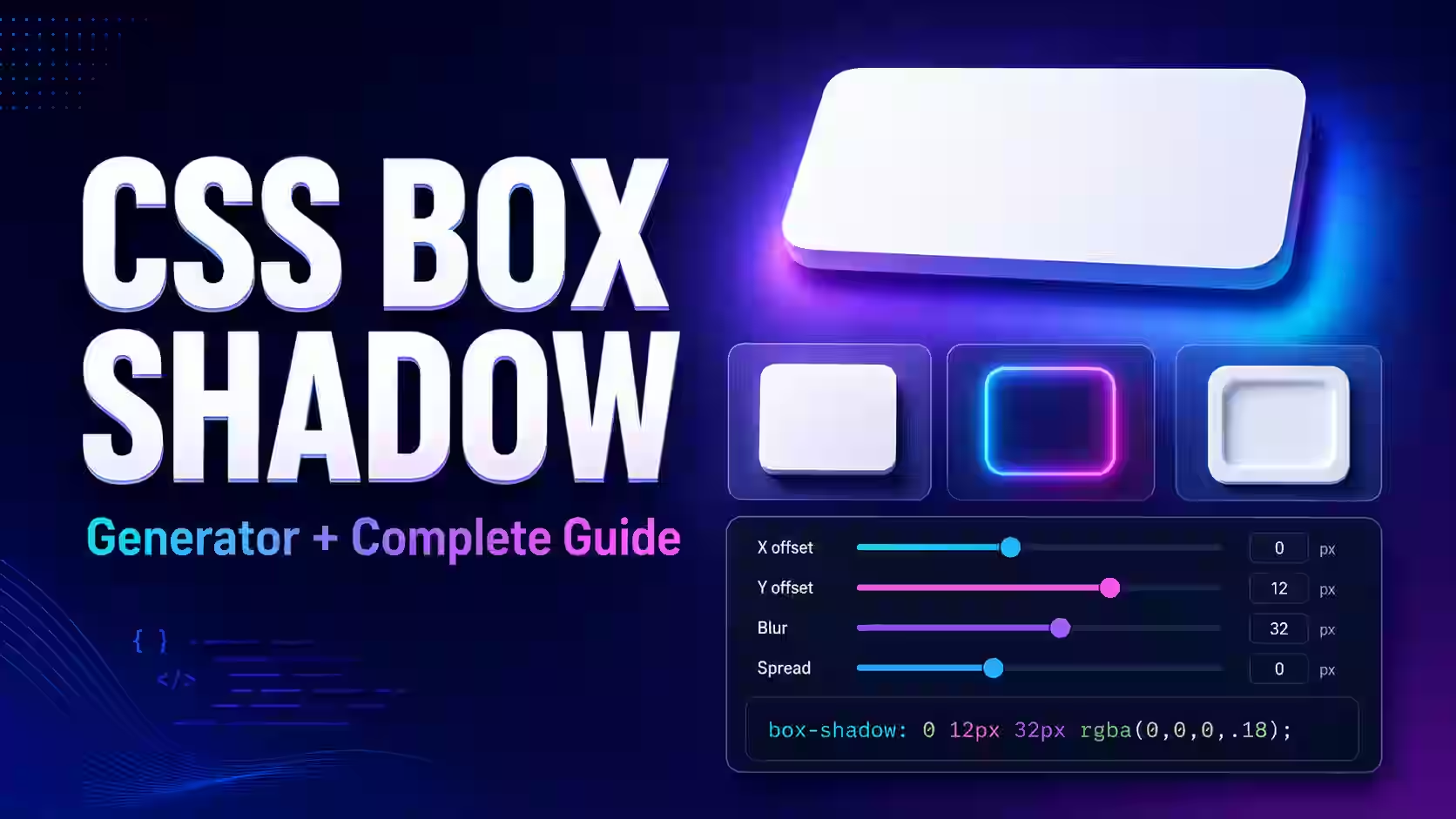
box-shadow: 0 24px 60px rgba(15, 23, 42, 0.35);A wide, soft shadow separates the glass panel from the background. Avoid an extremely dark or sharp shadow because it can overpower the translucent effect. Use the CSS Shadow Generator to visually adjust the offset, blur, spread, and color.
6. Protect text readability
A glass panel can look attractive while still being difficult to read. Keep sufficient contrast between the text and everything visible behind it. For example, white text normally works better when the panel sits over a dark background, while dark text may be more suitable for a bright glass card.
Do not rely on the shadow or blur alone to make text readable. Test the component with different backgrounds, screen sizes, and content lengths.
How to Use the MagicalToolz Glassmorphism CSS Generator
You can create the same effect visually with the free Glassmorphism CSS Generator:
- Open the generator in a modern browser.
- Select or adjust the background and glass colors.
- Change the transparency and blur until the background is softly visible.
- Adjust the border, corner radius, and shadow settings.
- Watch the live preview while changing each value.
- Copy the generated CSS.
- Paste it into your stylesheet and apply the class to your HTML element.
- Test the result with your actual text, background, and responsive layout.
The generator is especially helpful when you want to compare several variations without repeatedly editing numerical CSS values. It produces plain CSS, so you can customize the code further after copying it.
Why Is Backdrop Filter Not Working?
If your frosted glass effect CSS does not appear, check these common causes:
The panel is completely opaque
A solid background such as #ffffff hides everything behind the element. Replace it with an rgba(), hsla(), or another color format containing transparency.
There is nothing visible behind the panel
Backdrop blur affects the backdrop, not the element itself. Place the card over an image, gradient, pattern, or colored shape to make the blur noticeable.
You used filter instead of backdrop-filter
/* Blurs the element and its contents */
filter: blur(16px);
/* Blurs the area behind the element */
backdrop-filter: blur(16px);
Using filter: blur() on the card will also blur its text and buttons, which is generally not the intended glassmorphism effect.
A parent element changes the rendering context
Properties such as transforms, clipping, overflow, filters, and stacking contexts can change how the backdrop is rendered. If the effect fails inside a complex layout, test the glass card in a simple container and then reintroduce the surrounding styles one at a time.
The browser or device uses a different rendering path
Keep both the standard and WebKit-prefixed declarations, and provide a solid or nearly opaque fallback. Progressive enhancement is safer than making important content depend entirely on transparency.
Add a Browser Fallback
A fallback ensures that the card remains readable even when the full backdrop effect cannot be rendered.
.glass-card {
 background: rgba(30, 41, 59, 0.92);
 border: 1px solid rgba(255, 255, 255, 0.25);
}
@supports ((backdrop-filter: blur(16px)) or
 (-webkit-backdrop-filter: blur(16px))) {
 .glass-card {
 background: rgba(255, 255, 255, 0.16);
 backdrop-filter: blur(16px);
 -webkit-backdrop-filter: blur(16px);
 }
}
The base style provides a readable dark card. Browsers that support backdrop blur receive the enhanced glassmorphism appearance.
Make Glassmorphism More Accessible
Transparency can make boundaries and text harder to distinguish, especially for users with low vision or contrast sensitivity. Use glassmorphism as a visual enhancement, not as the only way to communicate structure or state.
- Keep body text and important controls at a strong contrast level.
- Use visible labels instead of relying only on placeholder text.
- Add clear hover, active, disabled, and keyboard-focus states.
- Do not place detailed imagery directly behind small text.
- Increase the panel opacity when the background is visually busy.
- Test the component in both light and dark color schemes.
- Keep essential content readable even when blur is unavailable.
You can also provide a more opaque alternative when a device reports a preference for reduced transparency:
@media (prefers-reduced-transparency: reduce) {
 .glass-card {
 background: #1e293b;
 backdrop-filter: none;
 -webkit-backdrop-filter: none;
 }
}
This media feature is not available in every widely used browser, so it should complement—not replace—a reliable default design.
Glassmorphism Performance Tips
Backdrop filters may require more rendering work than a simple solid background. A single moderate glass card is unlikely to be a problem on a modern device, but multiple large blurred layers, animated filters, or full-screen translucent surfaces can increase GPU work.
- Apply backdrop blur only to components that genuinely need it.
- Avoid animating the blur radius continuously.
- Keep the blurred area reasonably small.
- Do not stack many glass panels over one another.
- Test scrolling and animation on an average mobile device.
- Use a simpler fallback for low-power layouts when necessary.
Glassmorphism vs Neumorphism
Glassmorphism and neumorphism are sometimes grouped together, but they create depth in different ways.
| Feature | Glassmorphism | Neumorphism |
|---|---|---|
| Main appearance | Transparent or frosted glass | Soft raised or pressed surface |
| Main CSS technique | Transparency and backdrop blur | Light and dark box shadows |
| Best background | Gradient, image, or layered colors | Mostly uniform solid color |
| Common components | Cards, modals, headers, overlays | Buttons, switches, inputs, controls |
| Main accessibility risk | Unpredictable text contrast | Controls with unclear boundaries |
Glassmorphism is usually the better choice when you want transparency and visible background depth. Neumorphism can work for a small decorative control, but its subtle shadows should not be the only indication that an element is clickable.
Best Uses for a CSS Glass Effect
A glass effect works particularly well for:
- Dashboard statistic cards
- Portfolio and landing-page sections
- Login and registration forms
- Navigation bars over hero images
- Music and video player controls
- Pricing or product cards
- Modal windows and side panels
- Weather and finance widgets
Avoid applying glassmorphism to every element on a page. One or two well-positioned translucent surfaces normally create a clearer visual hierarchy than a screen filled with competing blurred panels.
Final Glassmorphism Checklist
Before adding your component to a production website, confirm the following:
- The glass panel has a partially transparent background.
- There is visible content or color behind the panel.
- The text remains readable over every possible background.
- Keyboard focus is easy to see.
- A usable fallback exists without backdrop blur.
- The layout works on narrow mobile screens.
- The effect does not cause slow scrolling or animation.
- The copied CSS has been tested inside your actual project.
Create Your Own Glassmorphism CSS
Glassmorphism is not a single CSS property or a fixed collection of values. It is a balance between transparency, blur, border, shadow, background detail, and readable content. Start with a simple card, test it against the real page background, and adjust the effect until it supports the interface rather than distracting from it.
Use the MagicalToolz Glassmorphism and Neumorphism CSS Generator to experiment with colors, opacity, blur, borders, and shadows through a live preview. Once the design looks right, copy the CSS, add it to your project, and complete the accessibility and browser-fallback checks described above.
Frequently Asked Questions
What is the CSS code for glassmorphism?
A basic glassmorphism effect uses a semi-transparent background with backdrop-filter: blur(), a translucent border, rounded corners, and a soft box shadow. The effect must sit over a visible background for the blur to appear.
How do I create a frosted glass effect in CSS?
Give the element a partially transparent background, apply backdrop-filter: blur(10px) or a similar value, and add a subtle border and shadow. Place it over an image, gradient, or colored shape.
Why is backdrop-filter blur not working?
The most common reasons are an opaque element background, nothing visible behind the element, use of filter instead of backdrop-filter, or interference from surrounding layout properties. Add transparency and test the card over a detailed background.
What is the difference between filter and backdrop-filter?
filter changes the element and its rendered contents. backdrop-filter changes the portion of the page visible behind the element while allowing the element’s own text and controls to remain sharp.
Can I make glassmorphism without JavaScript?
Yes. The standard glass effect can be created entirely with HTML and CSS. JavaScript is only needed if you want interactive controls, dynamically generated values, or other application behavior.
Does glassmorphism work on mobile devices?
It works in modern mobile browsers, but performance depends on the size and number of blurred surfaces. Keep the effect moderate and test it on a real mid-range phone before using it extensively.
Is glassmorphism accessible?
It can be accessible when text has strong contrast, controls have clear boundaries and focus states, and a more opaque fallback is available. Excessive transparency or visually busy backgrounds can reduce readability.
Can I use glassmorphism on a white background?
Yes, but the effect will need sufficient contrast. Use a slightly darker translucent panel, visible background shapes, a defined border, and a carefully balanced shadow so the card does not disappear into the page.
What is a good backdrop blur value?
There is no fixed best value. Around 8px to 20px is a useful starting range for many cards. Choose the final value according to the background detail, panel size, readability, and desired visual strength.
Is glassmorphism the same as neumorphism?
No. Glassmorphism uses transparency and background blur to create a frosted surface. Neumorphism uses paired light and dark shadows to make an opaque element appear raised or pressed into its background.
Is the MagicalToolz Glassmorphism CSS Generator free?
Yes. You can use the generator online to customize the visual effect and copy the resulting CSS without installing a design application.
Can I use the generated CSS in a commercial website?
The generated output consists of standard CSS values that you can incorporate into your project. You should still review the complete project, including any third-party fonts, images, icons, templates, or other assets, for their respective licence requirements.


 MagicalToolz AI Support
Comments (0)
Use comments for article-specific feedback. Use the contact page for bugs and support requests.
Leave a Comment
No comments yet. Be the first to share something useful.