

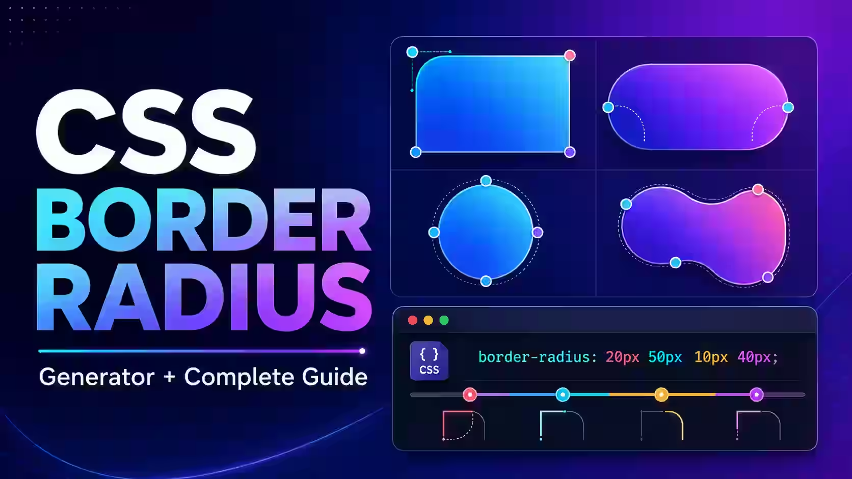
Rounded corners are everywhere in modern web design. You see them on buttons, cards, profile pictures, search boxes, navigation menus, modals, and mobile interfaces. CSS makes these shapes possible through the border-radius property.
A simple value such as border-radius: 12px; is easy to write manually. Things become less straightforward when every corner needs a different curve or when you want to create an elliptical, leaf-like, or organic shape. A CSS Border Radius Generator lets you design these curves visually, preview the result instantly, and copy the finished CSS without memorising the complete shorthand syntax.
This guide explains how CSS border radius works, how to use the MagicalToolz generator, and how to create rounded rectangles, circles, pill buttons, asymmetric cards, and custom organic shapes.
What Is the CSS Border-Radius Property?
The CSS border-radius property rounds the outer corners of an HTML element. Despite its name, an element does not need a visible border for rounded corners to work. The curve can also clip the element’s background color or background image.
Here is the simplest example:
.card {
 border-radius: 16px;
}
This applies a 16-pixel radius to all four corners. The result is a rectangular card with evenly rounded edges.
The border-radius property is shorthand for four individual properties:
border-top-left-radiusborder-top-right-radiusborder-bottom-right-radiusborder-bottom-left-radius
You can control these corners together with the shorthand or set each property separately.
Try the CSS Border Radius Generator Online
The MagicalToolz Border Radius Generator provides visual controls for every corner. It is useful when you want to compare shapes quickly or generate advanced elliptical values that would be difficult to calculate manually.
The tool can help you:
- Apply one radius to every corner
- Adjust all four corners independently
- Create circular and elliptical curves
- Design asymmetric cards and panels
- Build leaf, blob, and organic CSS shapes
- Preview every adjustment in real time
- Copy the generated
border-radiusdeclaration
How to Use the Border Radius Generator
- Open the CSS Border Radius Generator in your browser.
- Adjust the top-left, top-right, bottom-right, and bottom-left corner controls.
- Watch the preview change as you modify each value.
- Enable elliptical mode when you need separate horizontal and vertical radii.
- Continue adjusting the values until the preview matches your intended shape.
- Copy the generated CSS declaration.
- Paste the code into your stylesheet or component.
- Apply the CSS class to the relevant HTML element.
- Test the shape at different screen sizes before using it in production.
The generated CSS uses the standard border-radius property, so no JavaScript library or CSS framework is required to display the final shape.
Understanding Border-Radius Shorthand
The order of multiple border-radius values follows the corners clockwise, beginning at the top-left corner.
One value: all four corners
.box {
 border-radius: 20px;
}
All four corners receive a radius of 20px.
Two values: opposite corner pairs
.box {
 border-radius: 20px 50px;
}
The first value applies to the top-left and bottom-right corners. The second applies to the top-right and bottom-left corners.
Three values
.box {
 border-radius: 10px 30px 60px;
}10px: top-left30px: top-right and bottom-left60px: bottom-right
Four values: individual corners
.box {
 border-radius: 10px 25px 50px 75px;
}
The order is:
- Top-left
- Top-right
- Bottom-right
- Bottom-left
A useful way to remember the sequence is to begin at the top-left and move clockwise around the element.
How to Create Rounded Corners in CSS
To make a standard rounded card, combine border-radius with padding, a background, and an optional border or shadow:
.rounded-card {
 max-width: 420px;
 padding: 24px;
 background: #ffffff;
 border: 1px solid #e2e8f0;
 border-radius: 18px;
 box-shadow: 0 12px 30px rgba(15, 23, 42, 0.12);
}
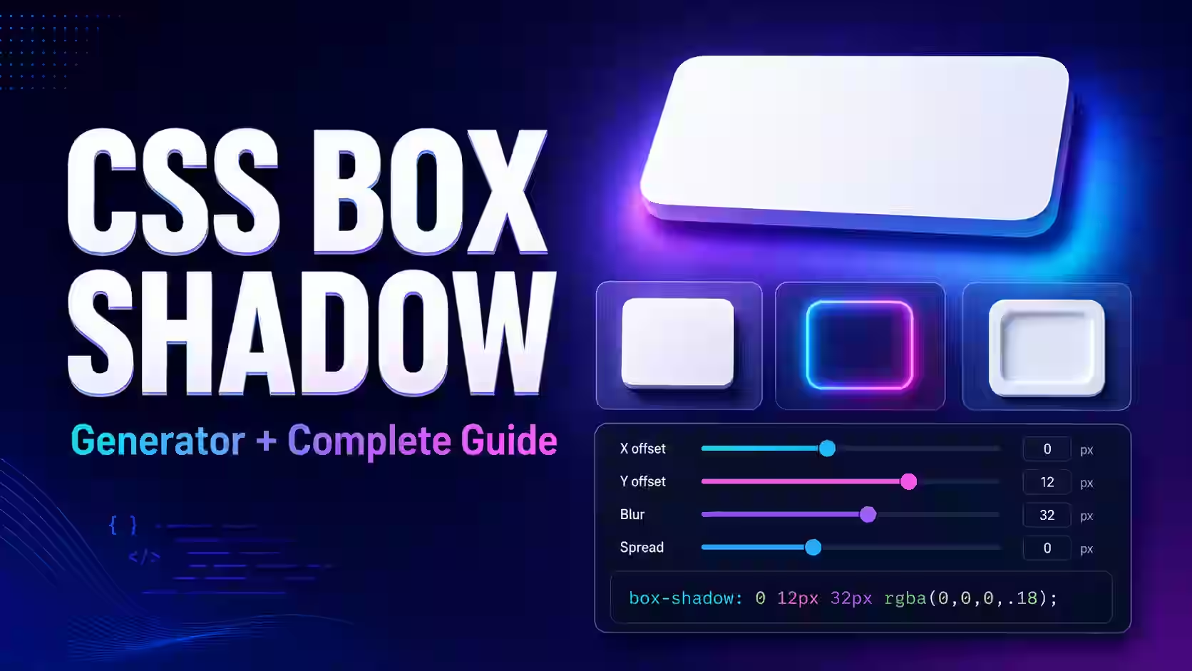
You can visually create the shadow with the CSS Shadow Generator and combine it with the radius code from this tool.
How to Make a Perfect Circle with Border Radius
Set the element’s width and height to the same value, then apply border-radius: 50%;.
.avatar {
 width: 120px;
 height: 120px;
 object-fit: cover;
 border-radius: 50%;
}
The equal width and height create a square box, while a 50% radius turns it into a circle. The object-fit: cover; declaration helps an image fill that circular area without being stretched.
If the width and height are different, border-radius: 50%; creates an oval instead of a perfect circle.
How to Create a Pill-Shaped Button
A pill button has fully rounded ends. You can create one by using a radius that is at least half the element’s height. Developers often use a deliberately large value such as 9999px so the component remains pill-shaped even when its size changes.
.pill-button {
 display: inline-flex;
 align-items: center;
 justify-content: center;
 min-height: 44px;
 padding: 10px 24px;
 color: #ffffff;
 font-weight: 700;
 text-decoration: none;
 background: #2563eb;
 border: 0;
 border-radius: 9999px;
 cursor: pointer;
}
The large radius does not make the corners expand outside the element. CSS automatically limits overlapping corner curves according to the available space.
For a complete button design, you can also use the Online CSS Button Generator.
Using Percentage Values
Border radius accepts percentages as well as fixed lengths:
.shape {
 border-radius: 30%;
}
Percentage values are calculated relative to the element’s dimensions. The horizontal radius is related to its width, while the vertical radius is related to its height. This means that the same percentage can look different on a square and a wide rectangle.
Use percentage values when the curve should scale with the element. Use px or rem when you want a more consistent corner size across elements.
Elliptical Border Radius and the Slash Syntax
CSS can assign separate horizontal and vertical radii to each corner. These two groups of values are separated by a forward slash:
.ellipse {
 border-radius: 40px / 80px;
}
The value before the slash controls the horizontal radius. The value after the slash controls the vertical radius.
You can use up to four values on each side:
.organic-shape {
 border-radius:
 60% 40% 30% 70%
 /
 50% 30% 70% 50%;
}
This eight-value syntax can produce organic shapes that would be difficult to create with a single radius. The generator’s elliptical mode is especially valuable here because it lets you experiment visually instead of repeatedly rewriting all eight values.
Create an Organic CSS Blob Shape
Here is a complete example of an organic decorative shape:
.css-blob {
 width: min(70vw, 360px);
 aspect-ratio: 1;
 background:
 linear-gradient(135deg, #8b5cf6, #06b6d4);
 border-radius:
 58% 42% 66% 34%
 /
 38% 56% 44% 62%;
 box-shadow: 0 24px 60px rgba(76, 29, 149, 0.3);
}
Because the radius values use percentages, the shape scales along with the element. You can use similar shapes behind hero content, profile images, product illustrations, or call-to-action sections.
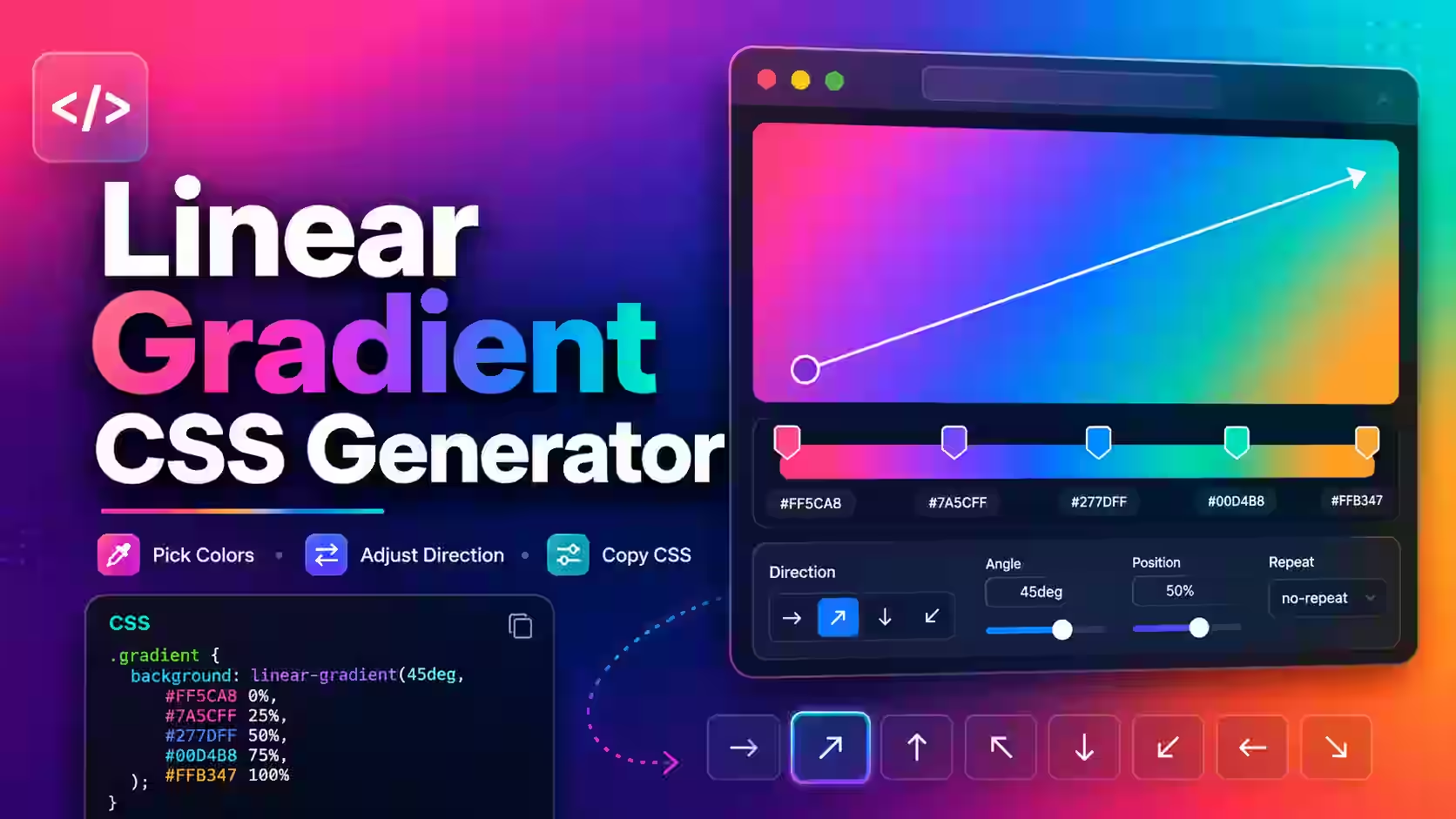
For a more decorative background, combine the shape with colors from the Gradient CSS Generator.
Border Radius for Images
Rounded images are useful for profile pictures, product images, testimonials, and gallery cards.
.rounded-image {
 display: block;
 width: 100%;
 height: 280px;
 object-fit: cover;
 border-radius: 24px;
}
The browser clips the image to the rounded outer edge. If child content, an image, or an overlay escapes a rounded container, add overflow: hidden; to that container:
.image-card {
 overflow: hidden;
 border-radius: 24px;
}
Use this carefully. overflow: hidden; can also clip dropdown menus, focus outlines, badges, and other content positioned outside the container.
Responsive Border-Radius Techniques
A fixed radius may look appropriate on a desktop card but too large on a smaller mobile component. The CSS clamp() function lets the radius change within a controlled range:
.responsive-card {
 border-radius: clamp(12px, 3vw, 28px);
}
This value will not fall below 12px or grow above 28px. Between those limits, it responds to the viewport width.
You can also change the radius at a breakpoint:
.responsive-panel {
 border-radius: 28px;
}
@media (max-width: 640px) {
 .responsive-panel {
 border-radius: 16px;
 }
}
Border Radius vs Clip Path
Use border-radius for rounded rectangles, circles, ellipses, pills, and smooth organic curves. It is concise, responsive, and widely supported.
Use clip-path when you need polygons, triangles, stars, or shapes with straight and precisely positioned edges. You can experiment with these using the CSS Clip-Path Maker.
| Requirement | Recommended CSS |
|---|---|
| Rounded card | border-radius |
| Circle or oval | border-radius: 50% |
| Pill button | Large border-radius |
| Organic blob | Elliptical border-radius syntax |
| Triangle or polygon | clip-path |
Common Border-Radius Problems
Border radius appears to do nothing
Check that the element has a visible background, border, image, or content area. Rounded corners on a completely transparent empty element may not be visually noticeable.
The image is not clipped to the corners
Apply the radius directly to the image or add the same radius and overflow: hidden; to its parent container.
Border radius does not create a circle
Confirm that the element has equal width and height. A rectangular element with a 50% radius becomes an ellipse.
The corner order looks incorrect
For four-value shorthand, remember the clockwise order: top-left, top-right, bottom-right, bottom-left.
A large radius looks smaller than expected
When corner curves would overlap, the browser proportionally reduces them so they fit inside the element. This behaviour prevents the curves from crossing one another.
Rounded corners look uneven on a responsive element
Percentage values respond to width and height independently. Use a fixed length or clamp() if you want a more predictable appearance.
Accessibility Tips for Rounded Components
Border radius is primarily visual, but the components using it still need to remain usable.
- Do not rely only on rounded shape to identify a button or input.
- Maintain adequate color contrast between text and background.
- Give interactive elements a visible keyboard focus state.
- Keep touch targets large enough to activate comfortably.
- Do not use
overflow: hidden;if it clips focus outlines. - Use meaningful HTML elements such as
for actions.
For example, a rounded button should still provide a clear focus indicator:
.rounded-button:focus-visible {
 outline: 3px solid #facc15;
 outline-offset: 3px;
}
Do You Still Need Browser Prefixes?
For normal modern-browser projects, the standard property is sufficient:
border-radius: 16px;Old declarations such as -webkit-border-radius and -moz-border-radius are generally unnecessary for current browsers. Adding obsolete prefixes makes the stylesheet longer without improving normal modern-browser support.
Best Practices for CSS Rounded Corners
- Use a consistent radius scale across the website.
- Reserve very large curves for pills, promotional cards, and decorative sections.
- Test asymmetric shapes with real content inside them.
- Avoid clipping keyboard focus outlines.
- Use percentages intentionally because they respond to element dimensions.
- Check the design on both small and large screens.
- Copy only the CSS values you need from a generator.
A simple design system might use 8px for small controls, 12px for inputs, 16px for cards, and a large value for pills. The exact scale should match your brand rather than following a universal rule.
Create Your CSS Border Radius
The border-radius property can do much more than soften the corners of a button. With one to four values, you can control every corner independently. With percentage values and the slash syntax, you can create circles, ellipses, leaf shapes, and responsive organic forms without using an image.
Open the free MagicalToolz CSS Border Radius Generator, adjust the four corners or enable elliptical mode, check the live preview, and copy the generated CSS into your project.



 MagicalToolz AI Support
Comments (0)
Use comments for article-specific feedback. Use the contact page for bugs and support requests.
Leave a Comment
No comments yet. Be the first to share something useful.